













St Eriksplan 3
113 21 Stockholm
Sweden


Clearon's offer had broadened and professionalised, but perception remained anchored in an older understanding of what the company does. The brief was clear: this was not a design refresh. It was a strategic assignment focused on simplification, business relevance and positioning — a platform to package a broadened offer, and to open doors to audiences beyond grocery retail. The brand needed to become clear to more people, without losing the heritage and industry knowledge built since 1968.
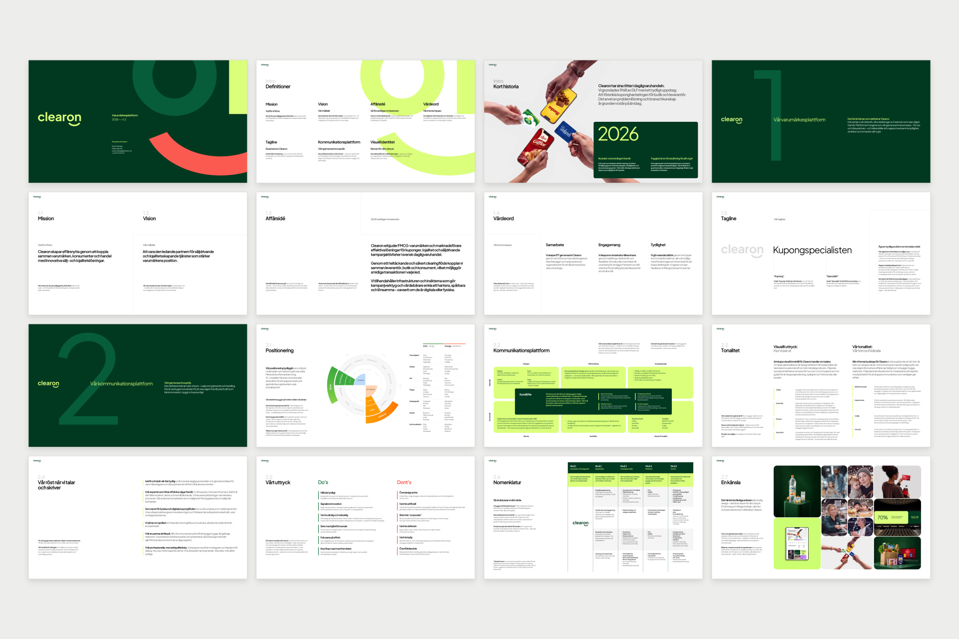
Ronnestam Creative Studio led the work from first analysis to finished brand book. Interviews with key people, competitor analysis and market immersion laid the foundation. Workshops built on the Jung 12 method anchored Clearon in clearly defined archetypes, while the Maslow Brand Effect model mapped the driving forces of Clearon's audiences — from functional needs to emotional impact. The strategy was then fixed in a complete platform:
From strategy to identity
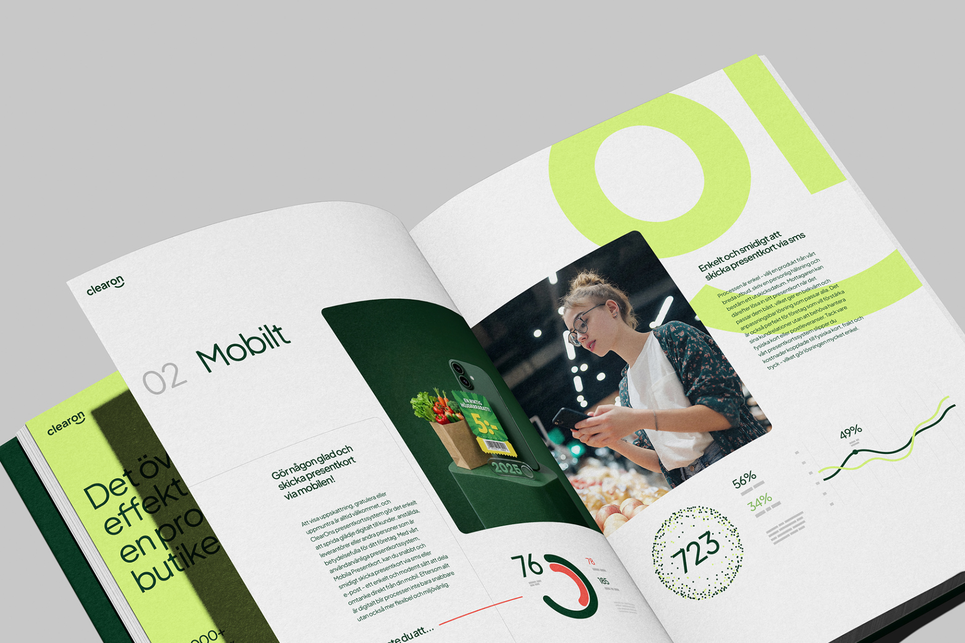
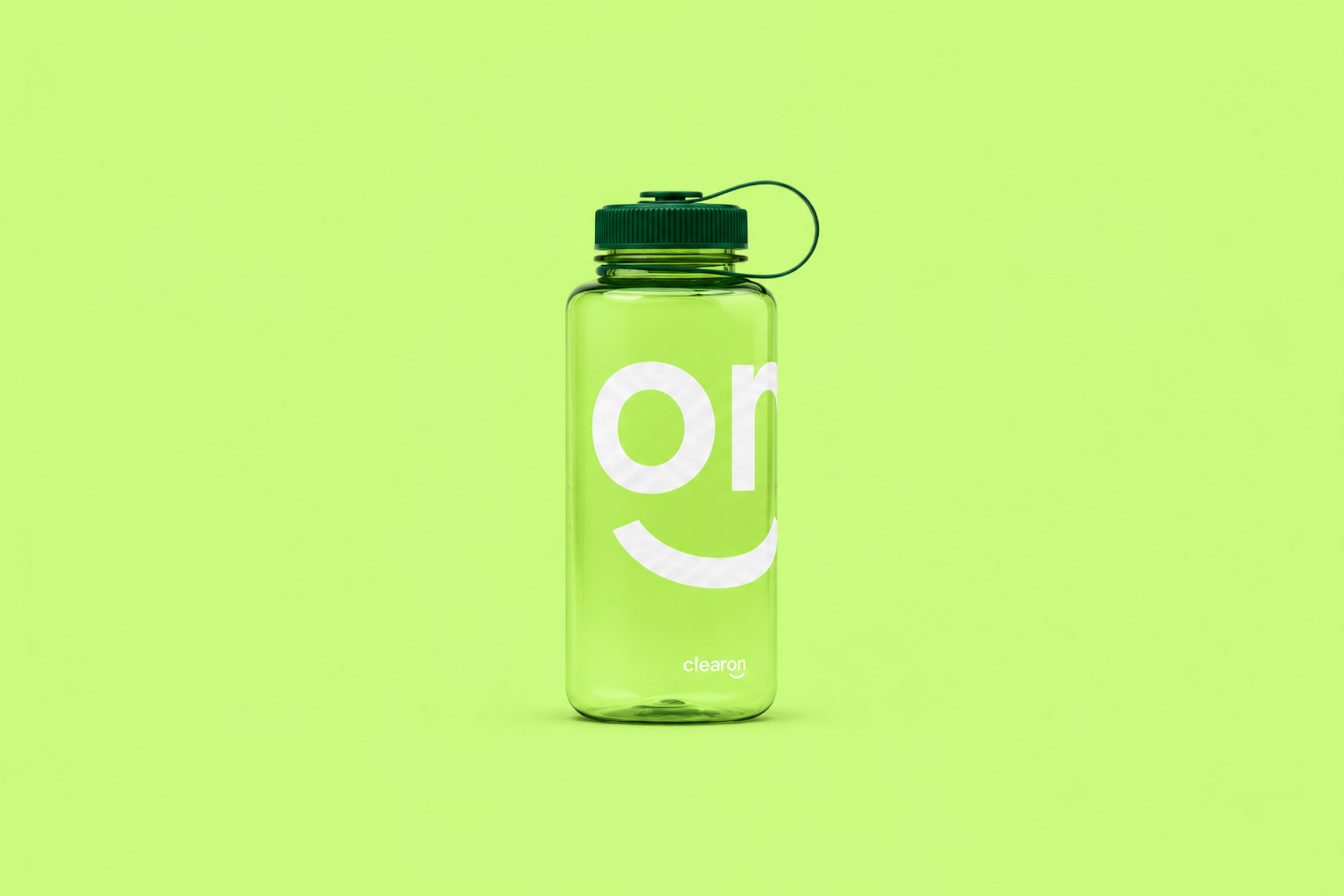
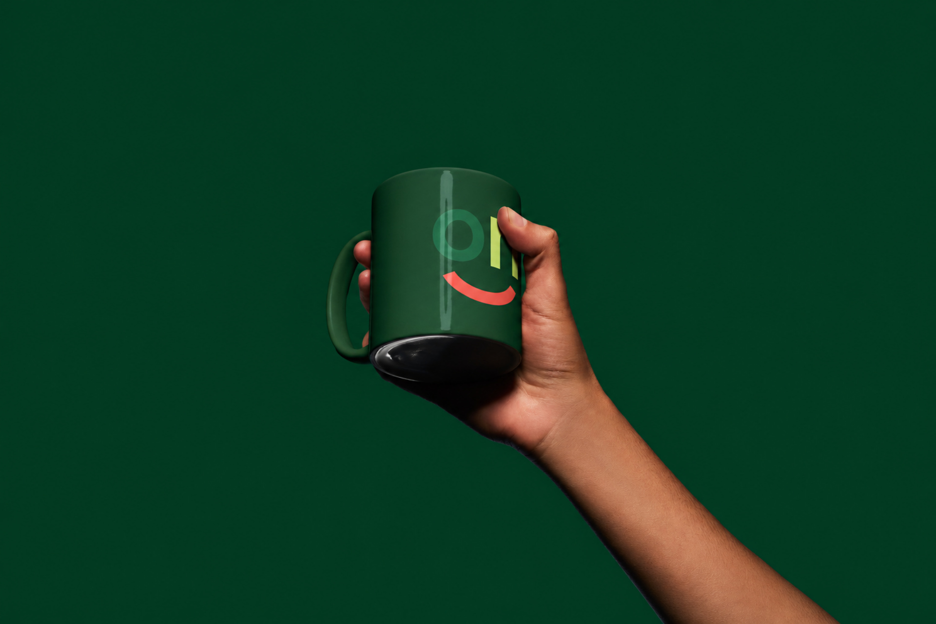
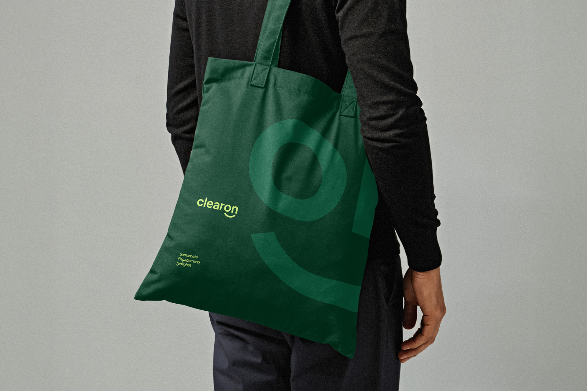
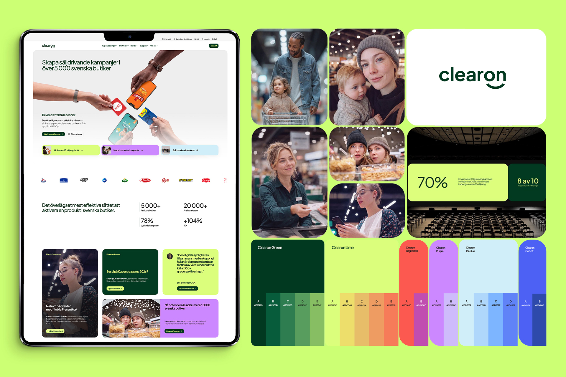
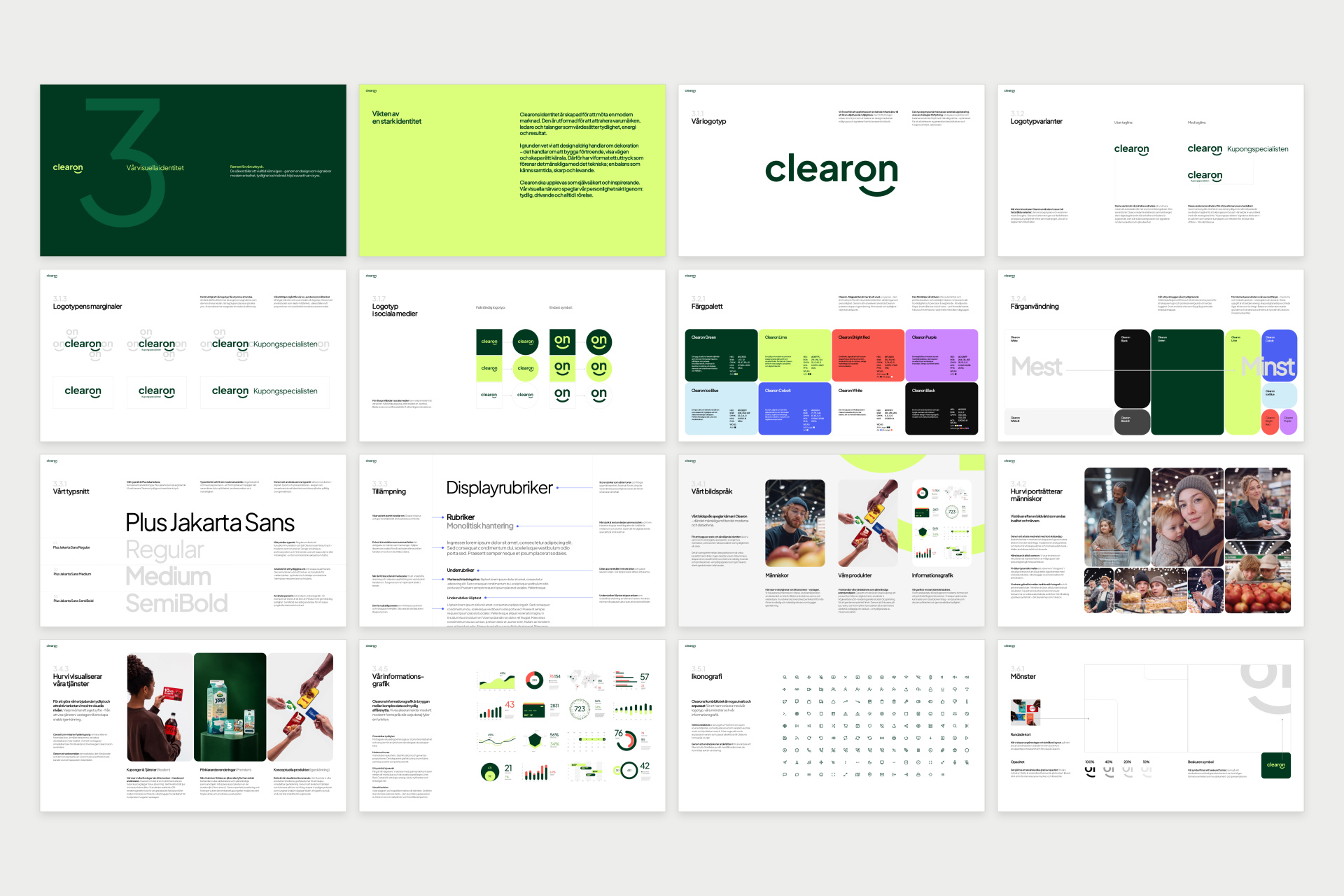
The platform then shaped a complete visual identity. The new logotype sets Clearon in lowercase — and lets the “on” break into a smile, turning the company's most transactional moment into its warmest. Around it sits a full system: the on-symbol, a colour palette anchored in deep Clearon Green with a lime signal colour and warm accents, the typeface Plus Jakarta Sans, a curated icon library, rounded image masks, graphic patterns drawn from the symbol, principles for information graphics and a photography direction built on warmth and real retail life.
Implementation
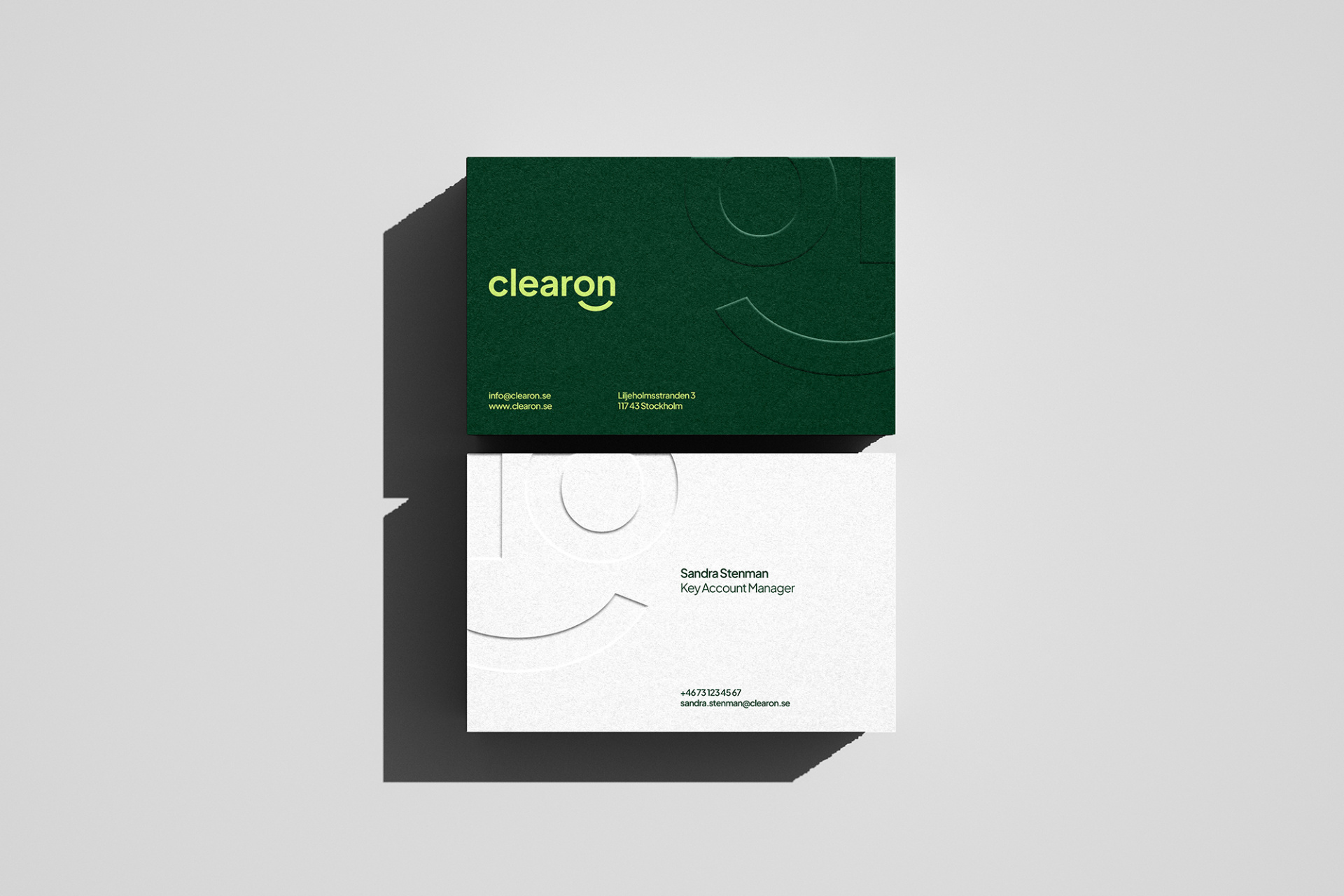
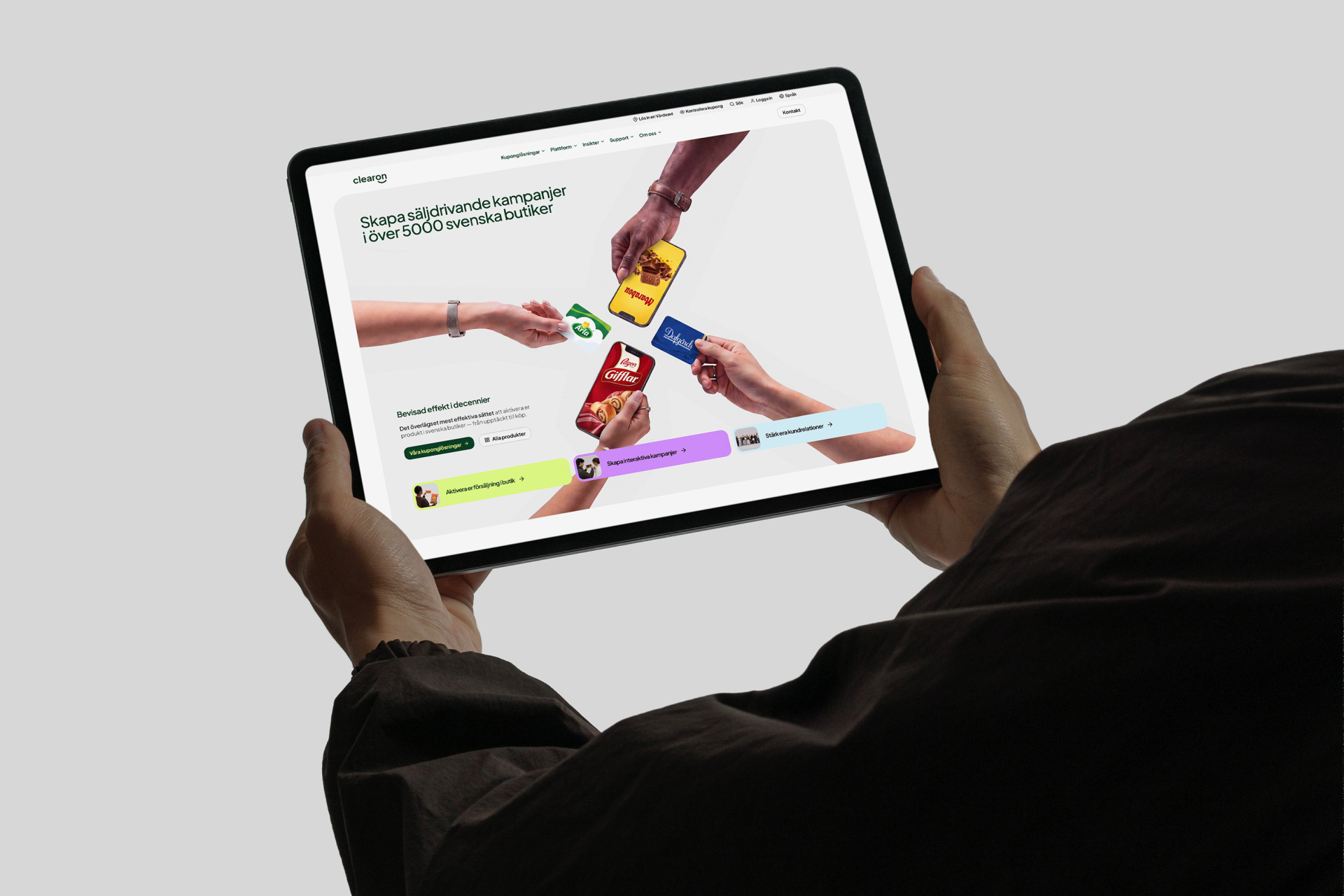
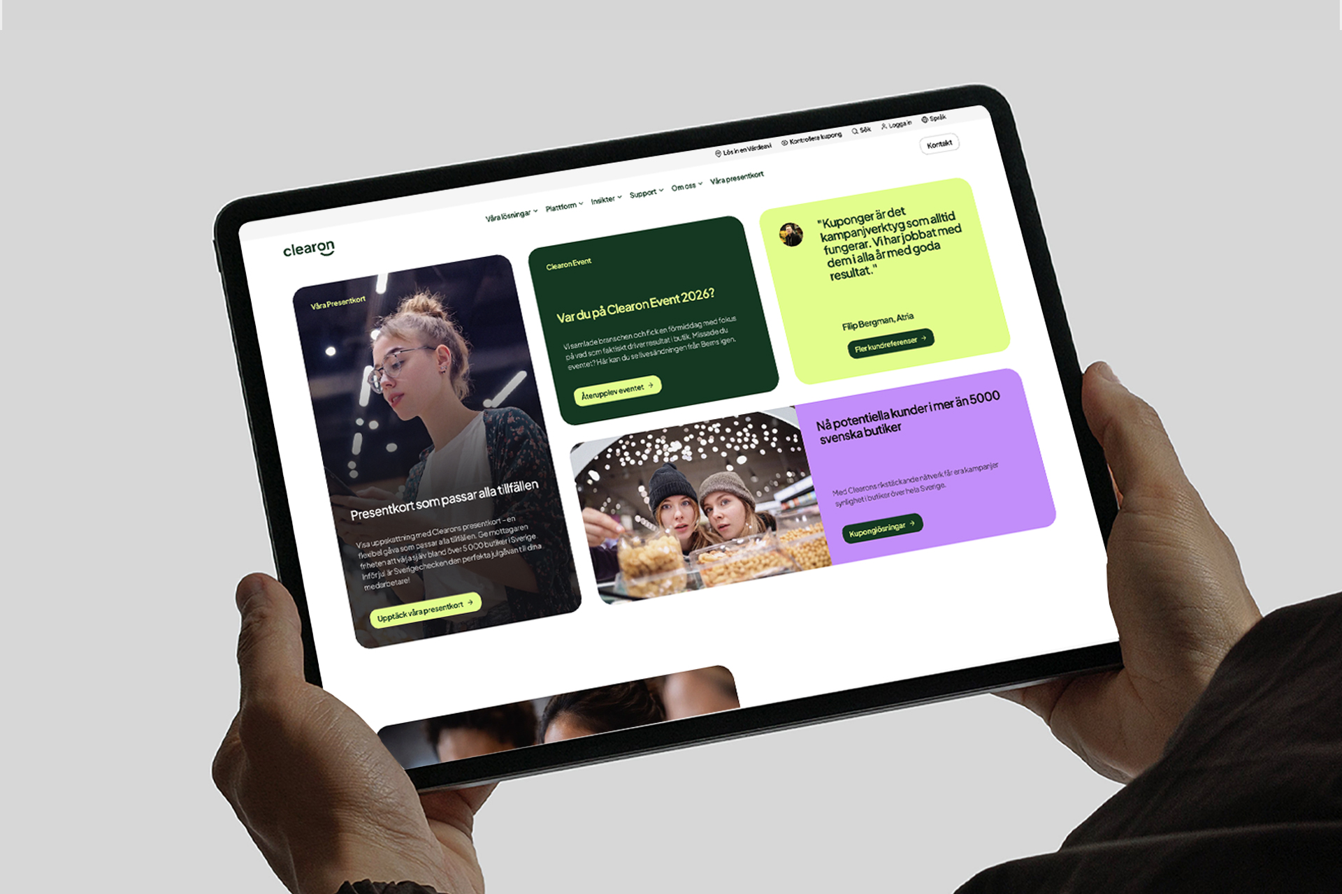
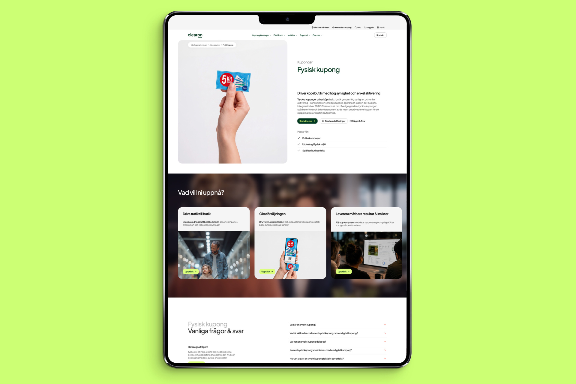
The largest part of the project was the implementation — a brand-new clearon.se, designed and built from the ground up in Webflow, the platform chosen by the studio. The identity was also rolled out across templates for PowerPoint and Word, business cards, social media assets, Teams backgrounds and executions for events, print and merchandise, where an external agency was brought in for merchandise production. The brand architecture was put to work immediately — Mobila Presentkort became the first service to launch on its own level within the new system. Everything was delivered as a 57-page brand guidelines document in PDF and PowerPoint. Johan Ronnestam led strategy and creative direction throughout, driving the website build together with designer Daniel Stridsberg.
“A brand like Clearon doesn't need to shout — it needs to be understood. We gave the coupon specialist a platform that simplifies the offer, and an identity that makes people smile back.”
— Johan Ronnestam
Clearon enters 2026 with a brand built to carry the business it is today — and the one it is becoming.