













St Eriksplan 3
113 21 Stockholm
Sweden


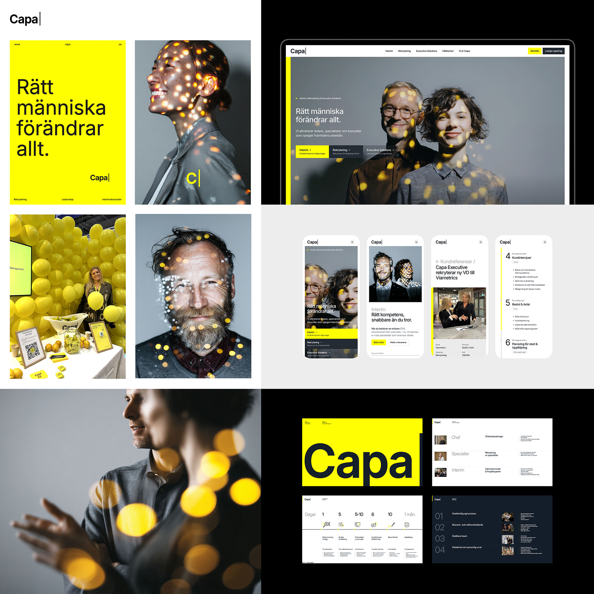
Capasearch had outgrown its own name. Ronnestam Creative Studio created the company's brand platform and identity in 2022, built around executive search. Three years later the owners decided to merge Capasearch with its sister company Capacify — specialists in interim solutions — into one company, in a market that had hardened into a sea of grey professionalism, where every firm promises the same process and the same people. The task: unite two brands under one sharper name, rework the entire profile, give the organisation a platform it can act on, and create an identity with enough energy to stand out in a category that rarely dares to.
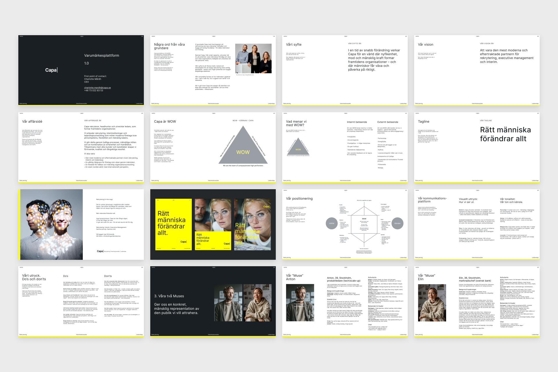
The studio guided the merger of Capasearch and Capacify into one brand: Capa — a shorter name for a broader company. The work was anchored in a new brand platform:
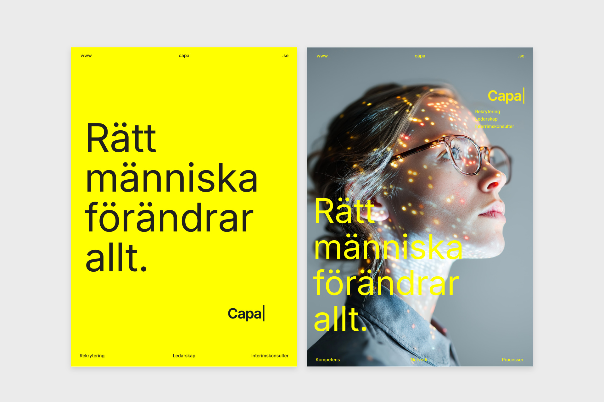
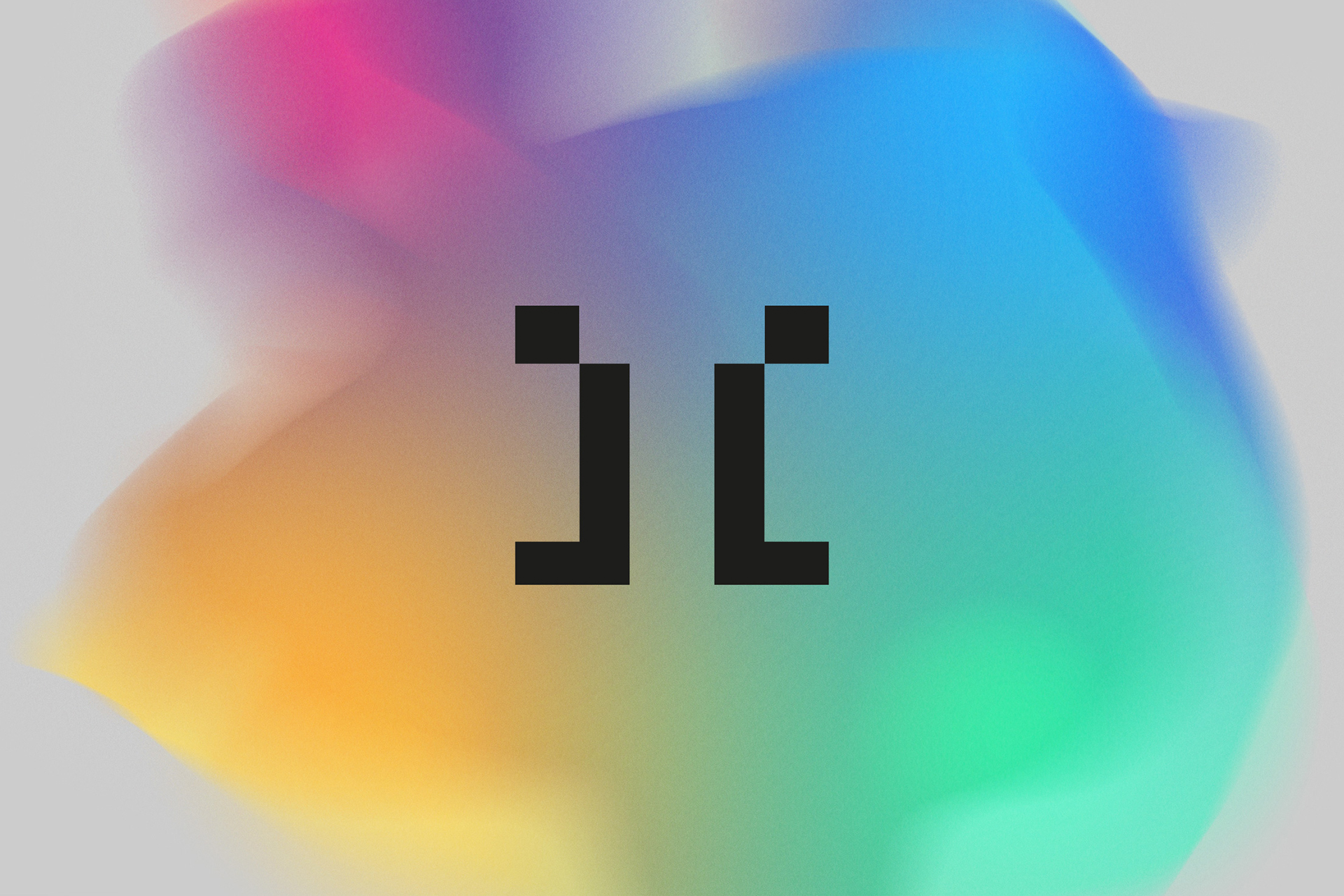
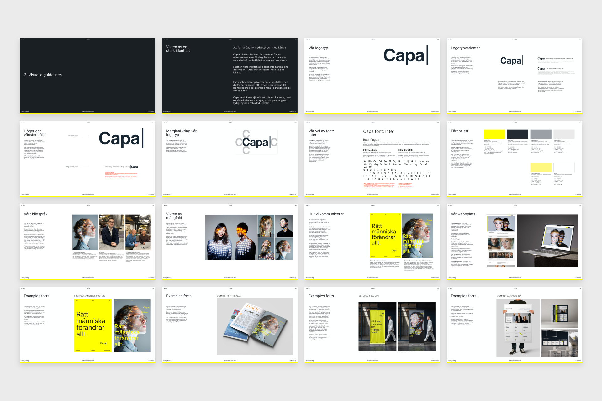
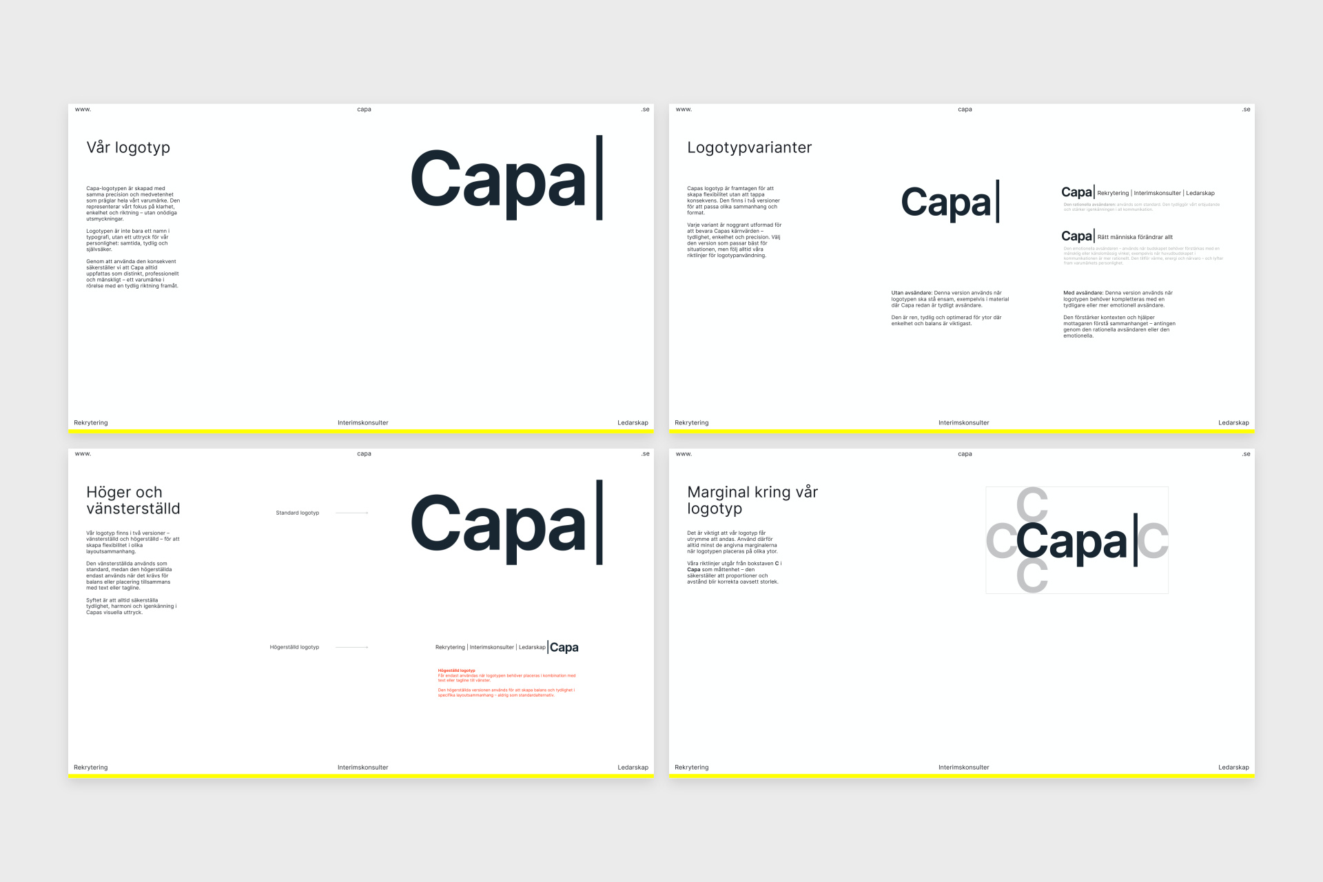
The identity evolves the equity built since 2022. The wordmark keeps its text-field cursor — the blinking signal of an ongoing search — now reduced to four letters: Capa. Capa Yellow leads a palette of warm greys and near-black, Inter carries the typography, and a new photographic language lets points of light play across muted portraits — the moment potential is found. Two advertising formats, emotional and copy-driven, give the brand reach from social posts to airport-scale media.
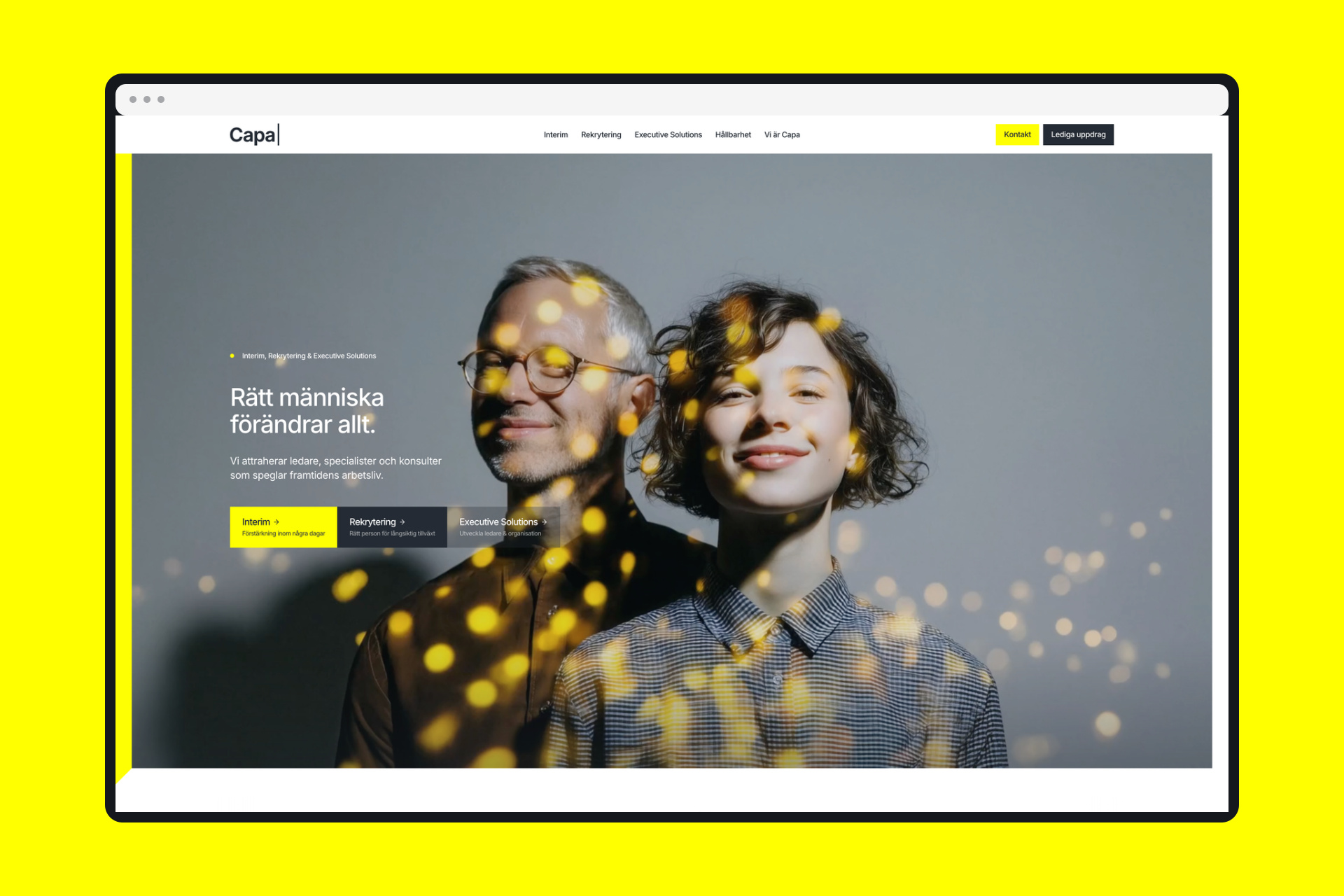
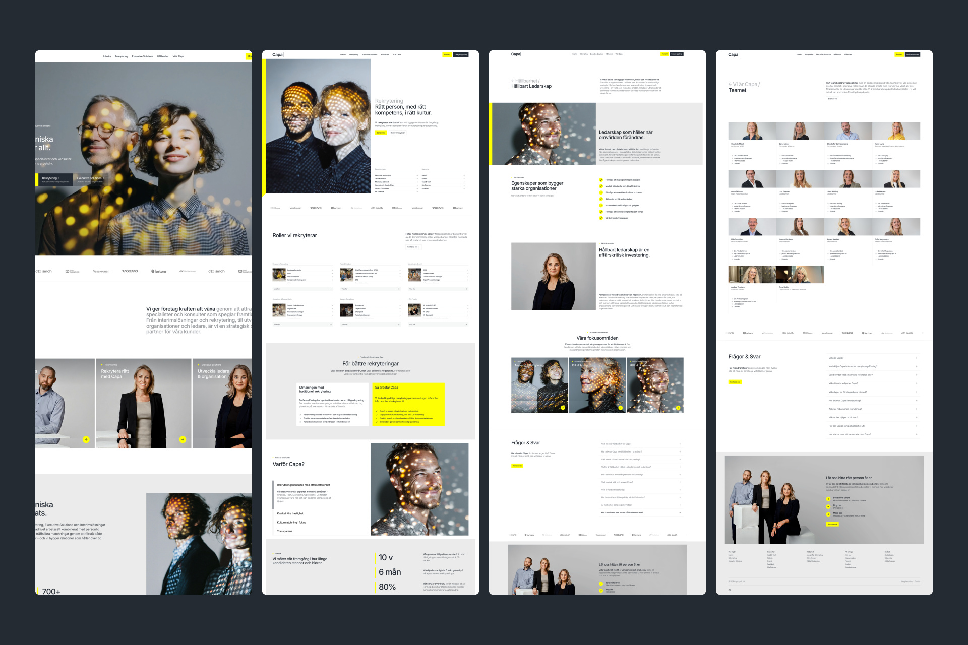
The platform was documented in a 45-page brand guideline. The largest part of the project was the implementation — a brand-new capa.se, designed and built from the ground up in Webflow, together with a new channel strategy for LinkedIn, Google, Meta and Instagram, image production, campaign formats, roll-ups, event concepts and the communication of Capametoden™, Capa's own recruitment method. Johan Ronnestam led strategy and creative direction throughout, driving the design and website build together with designer Daniel Stridsberg. The partnership continues — today Johan advises Capa's board and management team, driving innovation and brand.
Recruitment is a category where everyone claims the same things. We turned two companies into one brand — a shorter name, a sharper platform and an identity that radiates energy: yellow, human and impossible to mistake.
The result is a brand that holds together from boardroom to billboard — and a company with one name, one voice and one promise: the right person changes everything.