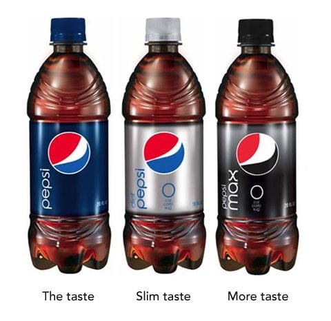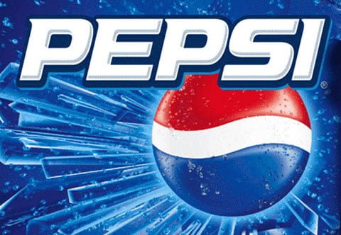
Pepsi has rebranded their classic logo with the help of the Arnell Group. Without commenting anything on the actual design itself I must say I like the touch of incorporating a dynamic element in the logo. As seen on the bottles, the new logo (or at least part of it) features a redesign of the classic strip + that it’s different depending on which type of Pepsi it’s nailed to.
The debate is pretty tense (most people tend to think the new one shit) in forums and on blogs whether the new Pepsi log design is better than the old design or not.

‘Old Pepsi logo’
Personally I think Pepsi is seeing a drop in sales due to the vitamin and healthy drinks that are covering the shelves in bars and stores. The new typing and logo categorization is probably an answer to this. But as always, without the brief…how can we know if it’s right or wrong.
Pepsi rebranding features dynamic logo
by
Tags: